Overview

Introduction

This page is an introduction to the code-example custom element. It provides a description of the library and acts as a reference for documentation and examples.

Custom Element

The <code-example> custom element renders code in a syntax-highlight text block and, if possible, the results of that code in a display frame.

The element is intended for use in documentation, tutorials, demos, or any other place where an example of code would be helpful.

To use the <code-example> custom element, add it to a page with at least one <code> element in its children.

Assign the code element a slot attribute to activate it as example code. Assign a class of language-js, language-html, or language-css to apply syntax highlighting for the respective language.

Installation

This library is available as a single file that can be referenced using a <script> element. It can also be installed using any of the javascript package managers below:

npm bun pnpm deno yarn npm install @magnit-ce/code-example

Documentation

Custom Element Documentation

Use the custom element documentation to learn more about how to integrate the code-example element into an html project.

Follow the README link to view the library's repository page and get a look at the source directly.

Quick Reference

Quick Start Snippet

Copy the code from this example and paste it into your project to have a simple starting point for working with this library.

document.body.append("Hello World");

Quick Reference Tables

Use the tables, below, to reference the key identifiers used by this custom element, including event types, attribute keys, slot names, and css properties.

Events

Name Description event.target details Content
preview

Dispatched before a preview's content is injected into the preview <iframe> element.

<code-example>
{
    code: string,
    html: string,
    style: string
}

Attributes

Attribute Description Values
preview

Used to disable the preview. Recommended over hiding preview with styles, because it prevents the preview from having scripts run or content styled.

  • false If set to false, prevents the preview content from being loaded, and hides the default preview content
script-module

Injects the script tags in the preview script as modules.

  • true If set to true, the preview script provided by the source code element will be given a type attribute of module
preview-script

Injects a script tag into the preview <iframe>'s document. Useful for including scripts without showing those as the example. One use case is dependency injection.

  • ["path/to/script.js"] The path provided here will be used as the src attribute of the script tag injected into the preview.
preview-script-module

Injects the script tags in the preview script as modules.

  • true If set to true, the preview script provided by the preview-script attribute will be given a type attribute of module
style-src

Adds a style element to the preview <iframe>'s document. Useful for styling the <iframe> document and content without using the styles as example code.

  • ["path/to/stylesheet.css"] Loads the stylesheet in the preview <iframe>'s document.

Slots

Slot Name Description Default Content
code-badge

An icon-like indicator for the language of the source code.

<span id="code-source-badge" class="badge">&lt;/&gt;</span>
code-title

The name of the language the source is coded in.

<span id="code-source-title" class="title">Code</span>
preview

The preview content for the example.

<iframe id="preview"></iframe>

Parts

This custom element does not expose any parts.

Classes

Class Name Description Default Styles
stack

Add this class to display each code source and the preview in a single vertical stack, rather than aligned horizontally.


:host(.stack)
{
grid-template-columns: 1fr;
}
:host(.stack) #sources
,:host(.stack) #preview
,:host(.stack) #spinner
{
grid-column: 1;
}
:host(.stack) #spinner
{
grid-row: 2;
}
:host(.stack) #preview
{
grid-row: 2;
min-height: 300px;
}
inline-editor

Add this class to display each code source beside each other inline. Can also be used while stack class is assigned.


:host(.stack.inline-editors) #sources
    {
        display: flex;
        flex-wrap: wrap;
    }
    :host(.stack.inline-editors) #sources .panel
    {
        flex-basis: 400px;
        flex-grow: 1;
    }

Properties

Property Description Default Value
--gap-small

A small spacer used for padding, margins, and gaps.

3px
--gap-medium

A spacer used for paddings, margins, and gaps.

6px
--spinner-track

The color of the loading spinner's track.

oklch(25.11% 0.006 258.36 / .2)
--spinner-thumb

The color of the loading spinner's progress indicator.

oklch(25.11% 0.006 258.36)
--surface-header

The background color of each source panel's header

oklch(25.11% 0.006 258.36)
--surface-source

The background color of each source panel.

oklch(91.87% 0.003 264.54)
--surface-html

The background color of the default html badge.

oklch(74.61% 0.171 51.56)
--surface-css

The background color of the default css badge.

oklch(54.87% 0.222 260.33)
--surface-code

The background color of the default unknown code language badge.

oklch(80.73% 0.002 247.84)
--surface-js

The background color of the default javascript badge.

oklch(89% 0.146 91.5)
--surface-success

The icon color used for the success icon used during copying.

oklch(70.03% 0.194 144.71)
--surface-error

The icon color used for the failure icon used during copying.

oklch(54.41% 0.214 19.06)
--text-header

The font color of the headers of each source panel.

oklch(61.01% 0.005 271.34)
--text-source

The font color of the source panels.

oklch(25.11% 0.006 258.36)
--text-html

The font color of the default html badge.

oklch(32.49% 0.113 51.98)
--text-css

The font color of the default css badge.

oklch(89.66% 0.046 260.67)
--text-code

The font color of the default unknown code language badge.

oklch(35.02% 0.005 236.66)
--text-js

The font color of the default javascript badge.

oklch(42.29% 0.097 91.9)
--badge-size

The width and height set for the code badge's container element.

26px

Configs

This library does not expose any configuration objects.

Enumerators

Name Description Values
CodeExampleSlotKeys

Used to provide keys for assigning slot values, instead of relying on string matches.

  • slot 'slot'
  • html 'html'
  • script 'script'
  • javascript 'javascript'
  • js 'js'
  • code 'code'
  • style 'style'
  • css 'css'

Constants

This library does not expose any constants.

Assignments

This library does not use any values directly from source code to assign values, properties, or attributes.

Examples

These examples are provided as simple references for practical use cases.

For specific details and feature maps, see the documentation.

Code and Preview

To embed an example, add a <code> element as a child to a <code-example> element. Make sure to include the slot attribute on the <code> element.

If your code example is written in javascript, html, or css, you can use the built-in code highlighting by adding a class of either language-js, language-html, or language-css, respectively.

In this example, the javascript code is given the class language-js, which highlights the code using javascript syntax. The code is also automatically executed in the preview <iframe>'s scope, with full access to its document.

const codeValue = 'This text was loaded dynamically from script'; document.addEventListener('DOMContentLoaded', () => { const div = document.createElement('div'); div.textContent = `Test Value: ${codeValue}`; document.body.append(div); });

Custom Preview

The <code-example> element's preview can be replaced entirely by using the preview slot.

When replacing the preview, the example code will be prevented from running because the default <iframe> will not be rendered.

Instead, the <iframe> will be replaced with the element that has been assigned a slot attribute of preview.

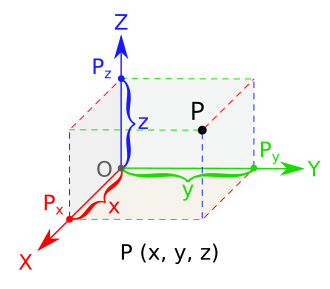
var volume = length * width * height; Illustration of volume on a coordinate planes diagram.

Only Code

For examples where a preview is not necessary, it is recommended to add a preview attribute with its value set to false.

Assigning the preview attribute to false prevents the script from being injected into the preview <iframe> and any javascript from executing.

npm install @magnit-ce/code-example

HTML, Javascript, and CSS Preview

The code-example element provides automatic execution in an inline <iframe> element for any javascript, html, or css that is provided as a code source.

This means that adding a <code> element with a class of language-html will automatically inject that element's content into the <iframe> as html code. Likewise, a <code> element with a class of language-css will automatically have its styles applied to the <iframe>.

For javascript, the script will run in the <iframe> and will have full access to that document.

const iframeValue = '123'; const iframeFunction = () => { console.log("this function should log to the preview iFrame's vm instead of the host document's process."); } document.addEventListener('DOMContentLoaded', () => { const div = document.createElement('div'); div.textContent = `Test Value: ${iframeValue}`; document.body.append(div); iframeFunction(); });

paragraph

span
div
body { background-color: #aadd22; color: #332211; }

Javacript Dependencies

Using javascript, a dependency can be imported using standard module imports instead of needing to be injected. For other types of code, though, dependencies may be useful for displaying content correctly in the preview.

Loading dependencies can be done using the preview-script attribute. Provide a path to a depdency script to have that script injected into the preview <iframe>.

If the dependency is a module, add the preview-script-module attribute to the <code-example custom element.

Multiple preview scripts may be provided. Use a comma to separate paths to preview scripts.

Custom Languages

The code-example element supports html, javascript, and css by default, but it can also be used for any arbitrary language.

Custom languages will be rendered as plain text unless custom code highlighting is provided by the developer. In this example, the python code is being highlighted with a plugin to the Prisma.js library for code highlighting.

In addition to highlighting the code, the preview can be replaced with content that is better suited to showcase an example's output. In this example, the preview is replaced with a mock terminal, to visually describe the expected results of the code example.

py Python def fib(n): a, b = 0, 1 while a < n: print(a, end=' ') a, b = b, a+b print()
> fib(1000)
> 0 1 1 2 3 5 8 13 21 34 55 89 144 233 377 610 987
.code-badge { display: grid; align-items: center; justify-content: center; text-shadow: 1px 1px 1px rgb(0 0 0 / .9); border-radius: 50%; background: linear-gradient(135deg, #4786b8, #4786b8 50%, #ffd744 50%, #ffd744); color: white; font-size: 12px; width: 26px; height: 26px; } .code-title { text-transform: uppercase; } .terminal { border: solid 2px white; box-shadow: 0 0 0 1px black; border-radius: 3px; height: 100px; color: #ccc; background: #161616; font-family: monospace; font-size: 16px; text-align: left; line-height: 1.5; overflow: auto; padding: .5em; } .terminal .cursor { display: inline-block; width: 1ch; background-color: white; border-bottom: solid 2px; animation: blink 2s infinite linear; } .terminal .cursor.insert { height: .9em; width: .7ch; } @keyframes blink { 0% { opacity: 1; } 49% { opacity: 1; } 50% { opacity: 0; } 99% { opacity: 0; } 100% { opacity: 1; } } import { pythonLoader } from './public/libs/python-loader.js'; // loaders are provided by the prism library; this example was copied from the prism source customElements.whenDefined('code-example') .then(() => { document.querySelector('code-example').loadLanguage(pythonLoader); });

Questions & Answers

Why do the <code> elements require a slot attribute?
Simplified: To make example code explicit and enable automatic code highlighting.
Details

The underlying library that is used for code highlighting needs to be invoked to parse the plain text code into class-assigned markup. Rather than assume all child <code> elements are valid for syntax highlighting, the library requires code that is example code to be explicitly marked.

By utilizing the slot attribute, the custom element's slotchange event can be monitored which provides automatic syntax highlighting without having to query the child elements.

How can I use a custom language and include syntax highlighting?
Simplified: Use the prismjs library's plugins and call loadLanguage using the plugin's loader.
Details

The <code-example> element depends on the prismjs library for the code highlighting features it provides. Using the plugins for that library allows additional code languages to have appropriate syntax highlighting.

Import or otherwise expose the prismjs plugin's "loader" function into the scope where the <code-example> element is referenced.

Use a reference to the <code-example> element to call the loadLanguage() method, passing in the plugin's loader function. The code will be refreshed with the new syntax highlighting applied.

Remember to include any styles required by the plugin in order to see the expected results.

For information about integrating prismjs plugins, see the prismjs website.